Signal

Honest writing on why products sell, and why they don't.

The same thinking that goes into a MarkLens read, written out in full. Every piece is here because founders actually search for it, not to fill a blog.
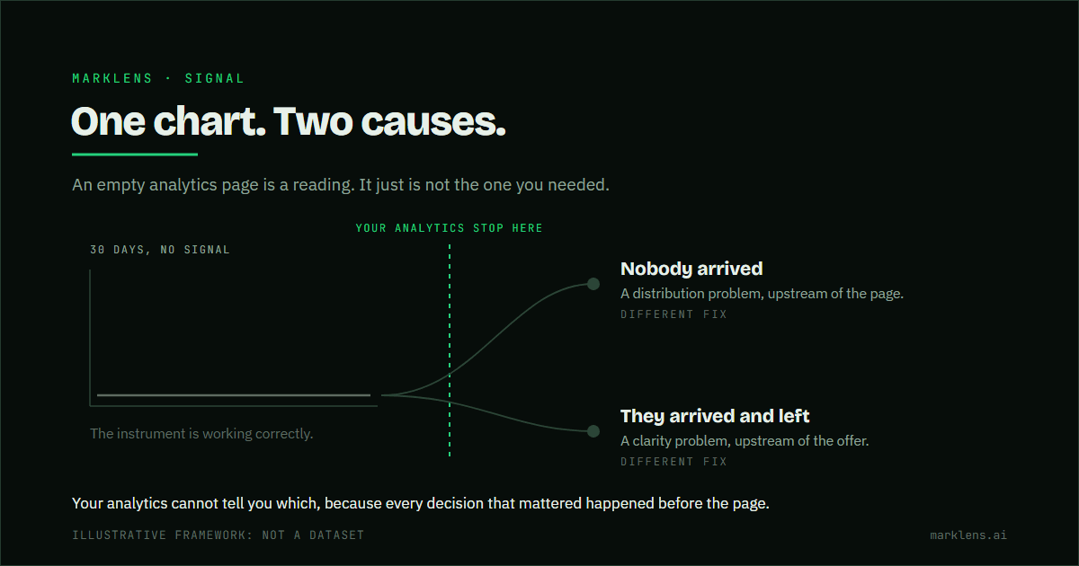
A flat line runs across a chart area labelled thirty days, no signal. To its right it forks into two muted branches: nobody arrived, marked a distribution problem upstream of the page, and they arrived and left, marked a clarity problem upstream of the offer. A green dashed boundary between the chart and the fork marks the point where the analytics stop recording, and both branches cross it.
August 4, 2026

An empty analytics page is still a reading

Nobody arrived and they arrived and left produce the same flat chart. They have completely different fixes, and your dashboard cannot separate them.

Read the diagnosis →
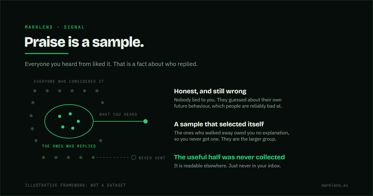
A wide field of muted marks stands for everyone who considered the product. A small green ring inside it encloses five green marks, labelled the ones who replied. A green line runs from the ring to the right, labelled what you heard. Below it a dashed line starts in the wider field and stops short at an open marker labelled never sent.
August 3, 2026

Everyone said they loved it. Nobody bought it.

Almost nobody lied to you. Praise is a sample of the people who chose to reply, answering a question about themselves they cannot answer accurately.

Read the diagnosis →
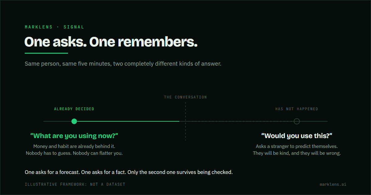
A timeline with the conversation marked in the middle by a dashed line. A green arrow runs left into the past to a solid marker labelled already decided, under the question what are you using now. A muted dashed arrow runs right into the future to an open marker labelled has not happened, under the question would you use this.
August 2, 2026

“Would you use this?” is the wrong question

Questions that point forward ask a person to predict themselves. Questions that point backward ask them to report what already happened.

Read the diagnosis →
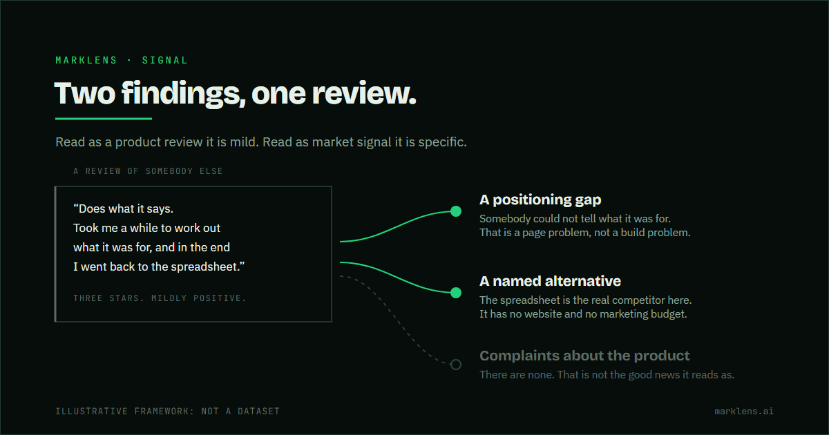
A quoted three-star review sits in a bordered block on the left. Two green lines run from it to two findings on the right: a positioning gap, taken from the reviewer saying it took them a while to work out what it was for, and a named alternative, taken from the spreadsheet they went back to. A third muted dashed line runs to an open marker labelled complaints about the product, which is empty.
August 1, 2026

The review wasn't about the product

A review records the gap between what somebody expected and what they got. The expectation is the part that tells you about the market.

Read the diagnosis →
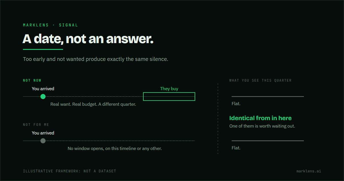
Two timelines drawn one above the other. On the upper one, labelled not now, a green marker shows where you arrived, a muted dashed stretch marks the wait, and a green band further right marks the buying window opening. On the lower one, labelled not for me, the same green marker is followed by a dashed run that never reaches a window. To the right of a dashed boundary, both timelines produce an identical flat line, labelled what you see this quarter.
July 31, 2026

“Not now” isn't a no

Real want, real budget, and neither of them this quarter. It produces the same silence as genuine rejection, and it is the most comfortable explanation available.

Read the diagnosis →
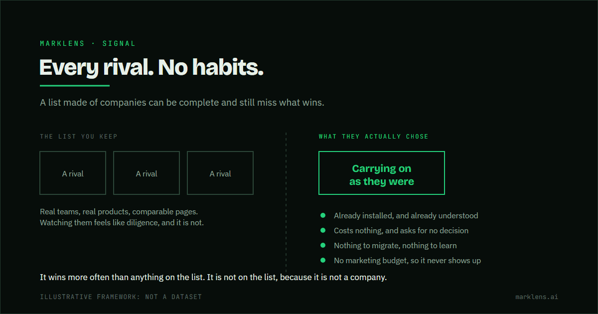
Diagram contrasting a competitor list with the real alternative. Three muted blocks on the left, each labelled a rival, sit under a heading reading the list you keep. A dashed boundary separates them from one green block on the right labelled carrying on as they were, under a heading reading what they actually chose. Four green marks beneath name why it wins: already installed, costs nothing, nothing to migrate, and no marketing budget.
July 30, 2026

Your biggest competitor isn't a company

A competitor list made of companies can be complete and still miss what actually wins: carrying on as they were.

Read the diagnosis →
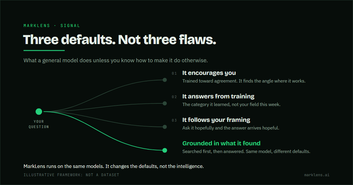
Divergence diagram. One question enters at the left and three muted paths curve away from it to three defaults a general AI model falls into: it encourages you because it is trained toward agreement, it answers from training rather than the live market, and it follows the framing of the question. A fourth path, drawn in green, runs to an answer grounded in what was actually found, searched first and then answered. A closing line notes MarkLens runs on the same models and changes the defaults rather than the intelligence.
July 29, 2026

You have ChatGPT open right now. Here is why that might not be enough.

We are built on Anthropic's models, so we will not pretend the general ones are weak. The gap is not intelligence. It is three defaults.

Read the diagnosis →
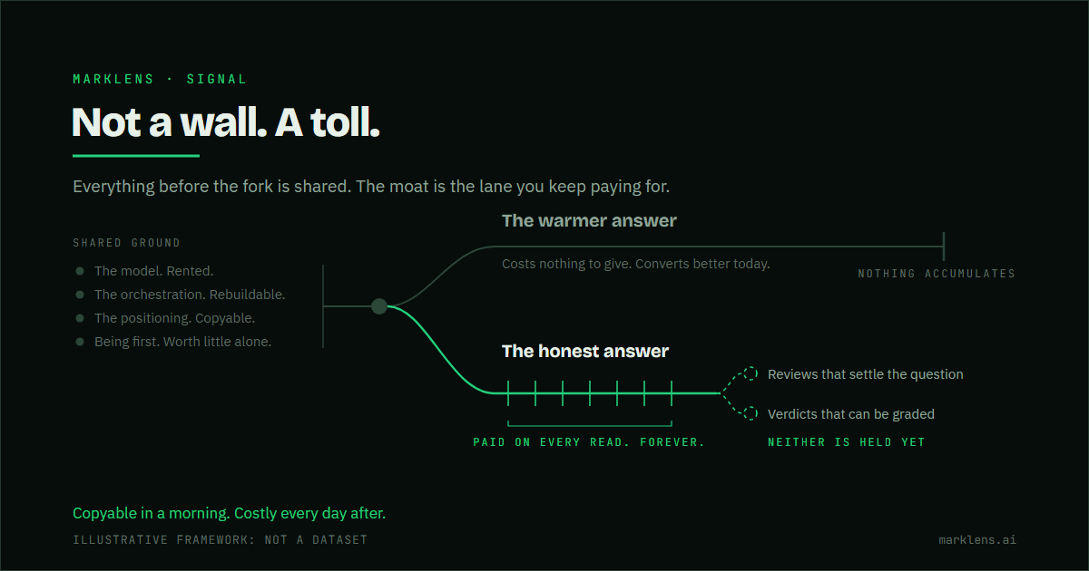
Fork diagram. Four things that are not defensible sit together as shared ground: the rented model, the rebuildable orchestration, the copyable positioning, and being first. One line runs from them to a fork. The upper lane, in muted grey, is the warmer answer, which costs nothing to give and converts better today, and it stops at a bar marked nothing accumulates. The lower lane, in green, is the honest answer, crossed by seven gates bracketed as paid on every read, forever, and it carries on to two dashed marks, reviews that settle the question and verdicts that can be graded, both labelled as not held yet.
July 29, 2026

MarkLens has no proprietary technology. Here is the actual moat.

The model is rented and the orchestration is copyable. We name everything that is not a moat before naming the one thing that is.

Read the diagnosis →
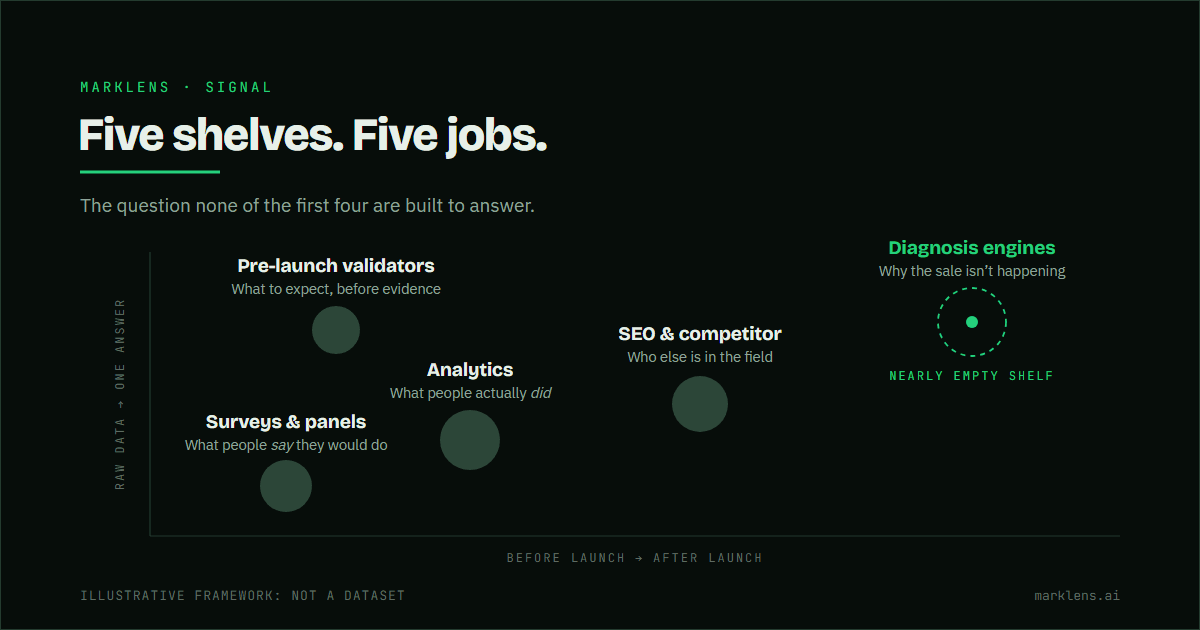
Map with two descriptive axes, one running from before launch to after launch and one from raw data to one answer, placing five categories of market research tool by the job each does: surveys report what people say, analytics what people did, SEO and competitor tools who else is in the field, pre-launch validators what to expect before there is evidence, and diagnosis engines why the sale isn't happening. Neither axis is a ranking. The diagnosis position is drawn as an open dashed outline and labelled a nearly empty shelf.
July 14, 2026

Every market research tool tells you what happened. None tell you why it isn’t selling.

Twenty products, five different jobs. And the job you came for sits on the shelf almost nobody stocks. We named ourselves in the map without ranking ourselves.

Read the diagnosis →
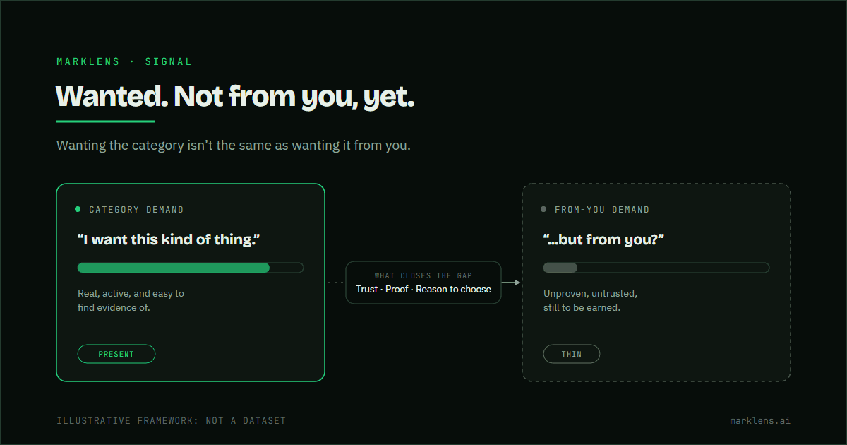
Diagram showing the gap between category demand, wanting this kind of product, and from-you demand, wanting it specifically from this seller, with trust and proof shown as what bridges the gap.
July 6, 2026

The market wants this. Just not from you, yet.

Category demand and from-you demand are different things. A good product can have plenty of the first and almost none of the second.

Read the diagnosis →
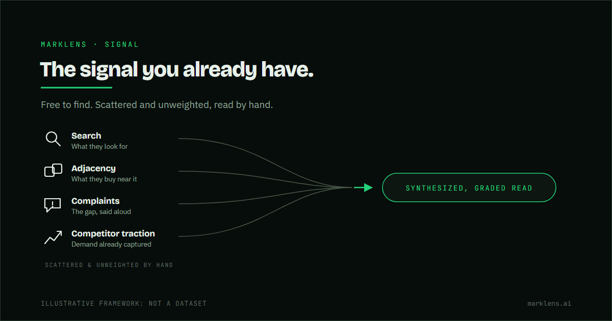
Four free sources of demand signal stacked down the left: search, what they look for; adjacency, what they buy near it; complaints, the gap said aloud; and competitor traction, demand already captured. Four muted lines run rightward from them and converge on a single point, which arrows into one pill marked synthesized, graded read. The sources are labelled scattered and unweighted by hand, which is the state they are in before anything joins them up.
July 6, 2026

Reading demand signal without a research budget

Search behavior, adjacent purchases, complaints, competitor traction: the signal is free. Reading it accurately, without bias, is the hard part.

Read the diagnosis →
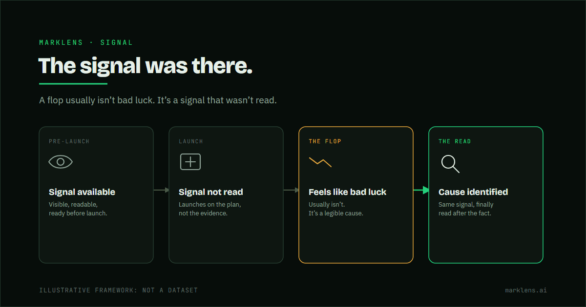
Timeline diagram showing a pre-launch signal being available but ignored, leading to a launch flop, with a read afterward finally reading the same signal to identify the cause.
July 6, 2026

Why the launch flopped: what the signal actually said

A launch flop feels like bad luck. Usually the cause was legible in the signal beforehand. It just wasn't read.

Read the diagnosis →
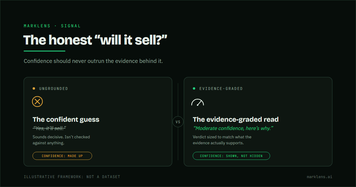
Diagram contrasting an overconfident yes/no answer to 'will it sell' with an evidence-graded read that shows confidence level alongside the verdict, illustrating how confidence should never outrun the evidence behind it.
July 6, 2026

The honest answer to “will it sell?”

Confidence that outruns evidence isn't an answer: it's a guess wearing a suit. Here's what an honest read of 'will it sell' actually looks like.

Read the diagnosis →
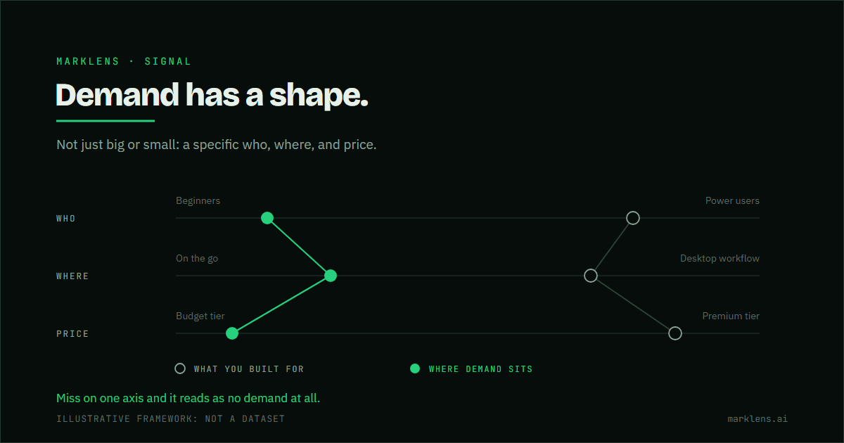
Three parallel axes drawn one above the other, each running left to right: beginners to power users, on the go to desktop workflow, and a budget tier to a premium tier. Every axis carries two marks, an open muted mark for what the product was built for and a filled green mark for where demand actually sits. Each set of three is joined into a profile, so the product traces one shape and demand traces another, offset from it on all three axes. No axis carries a number.
July 5, 2026

The demand is real. You built for the wrong slice of it.

Some interest, no conversion, isn't always weak demand. It's often real demand: for a different who, where, or price.

Read the diagnosis →
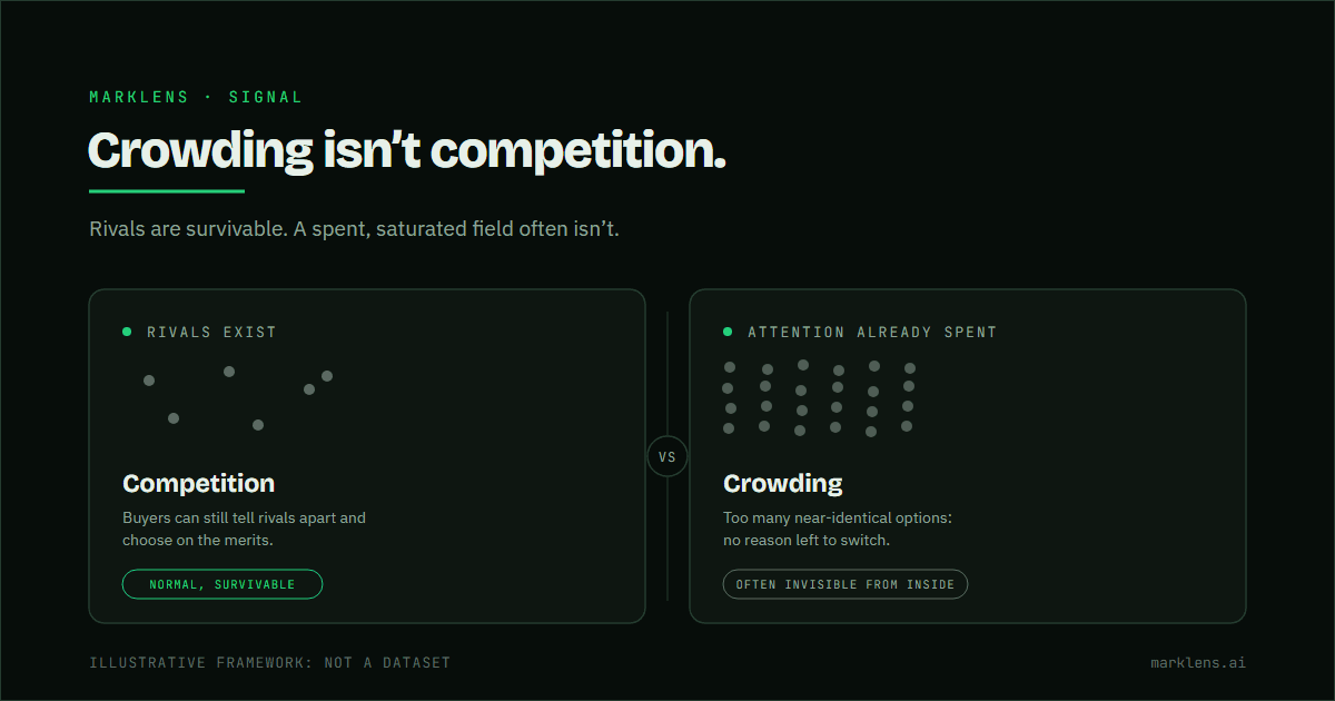
Comparison diagram of competition versus crowding: competition means rivals exist and is survivable, crowding means the buyer's attention and trust are already spent across too many near-identical options with no reason to switch.
July 5, 2026

Crowding isn't competition

Rivals are normal. Crowding is different: it's when the buyer's attention is already spent and nothing gives them a reason to switch to you.

Read the diagnosis →
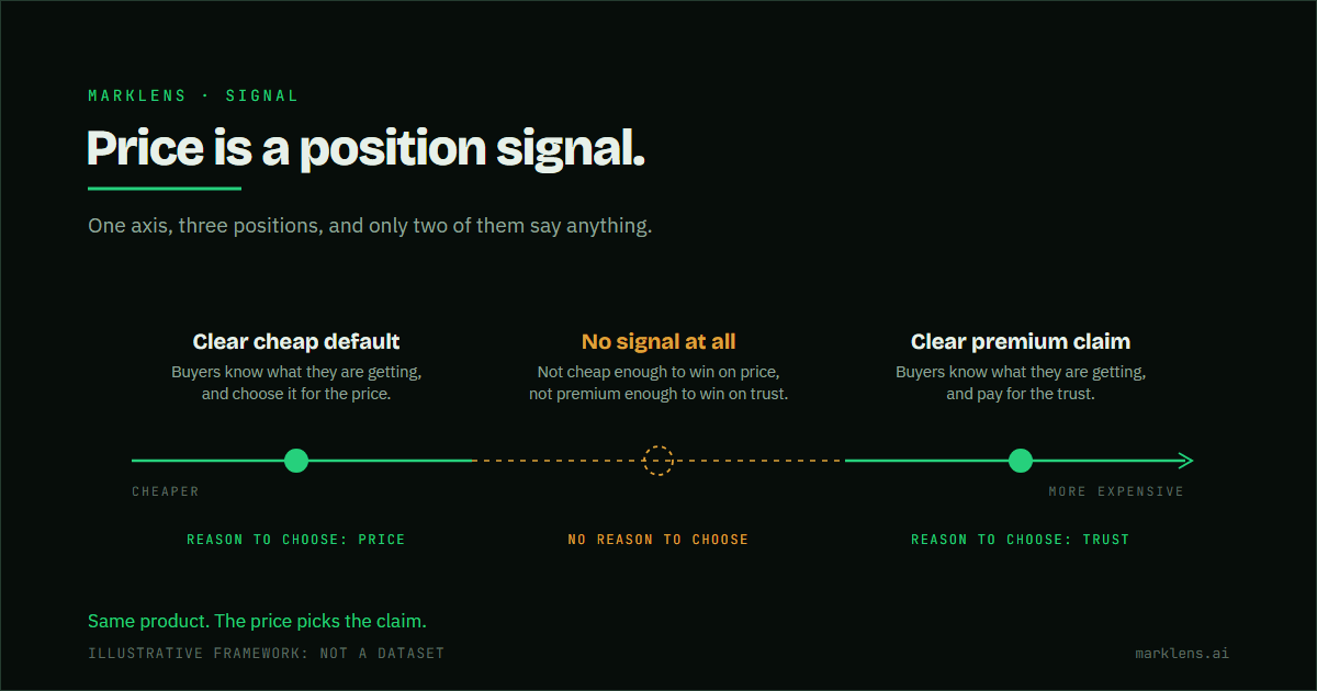
A price axis running left to right from cheaper to more expensive, drawn solid green at both ends and broken into an amber dashed segment across the middle. A filled mark at the cheap end is a clear cheap default, chosen for the price. A filled mark at the expensive end is a clear premium claim, paid for on trust. Between them an open amber mark sits on the broken stretch, because a middle price is not cheap enough to win on price and not premium enough to win on trust, and so gives a buyer no reason to choose.
July 5, 2026

Priced right, still not selling

Price doesn't just cover cost. It tells the buyer what tier you're claiming. And a 'fair' number can still land in the one spot with no reason to choose it.

Read the diagnosis →
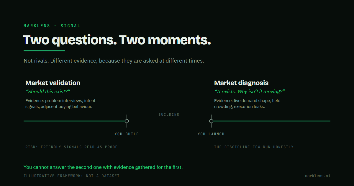
Timeline running left to right with two events marked on it, you build and you launch. Before the build, market validation asks whether this should exist, answered with problem interviews, intent signals and adjacent buying behaviour, and carrying the risk that friendly signals read as proof. Between the two events the line is muted and marked building, because neither question applies while the work is being done. After the launch, market diagnosis asks why it is not moving now that it exists, answered from live demand shape, field crowding and execution leaks.
July 4, 2026

Market validation vs. market diagnosis

Validation asks if it should exist. Diagnosis asks why it isn't moving. Most founders keep doing the first when they need the second.

Read the diagnosis →
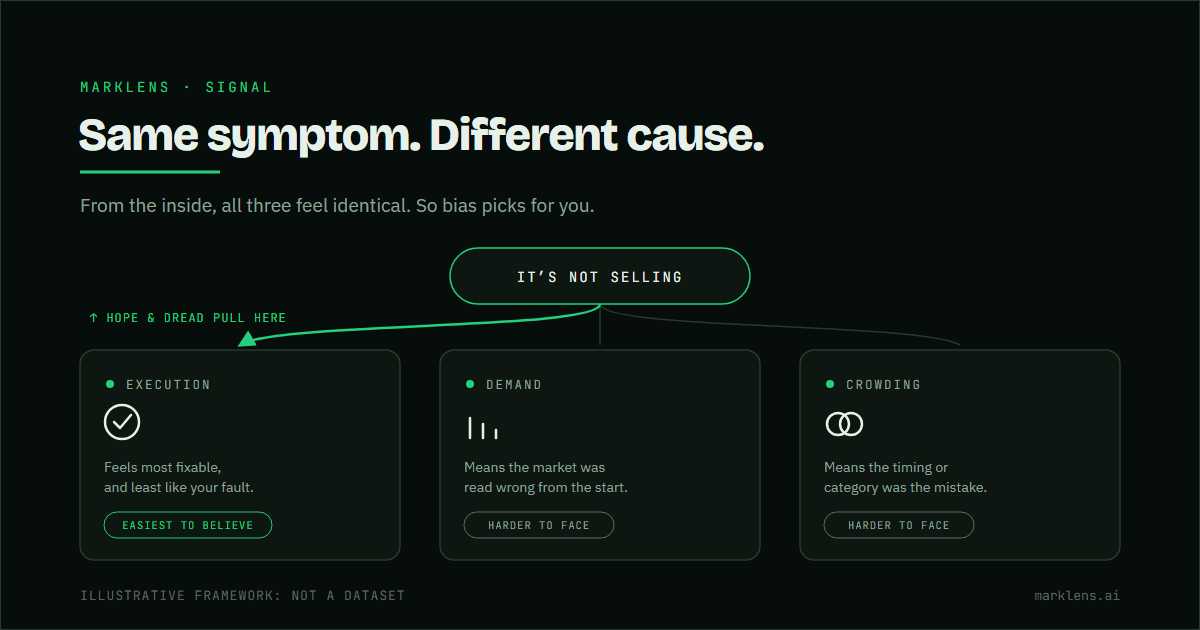
Diagram showing one identical symptom, a product not selling, branching into three possible causes, with a bias arrow showing how hope and dread pull founders toward the easiest-to-bear explanation instead of the true one.
July 4, 2026

Why you can't diagnose your own product

From inside your own head, every cause feels identical. The one you land on says more about what you can bear than what's true.

Read the diagnosis →
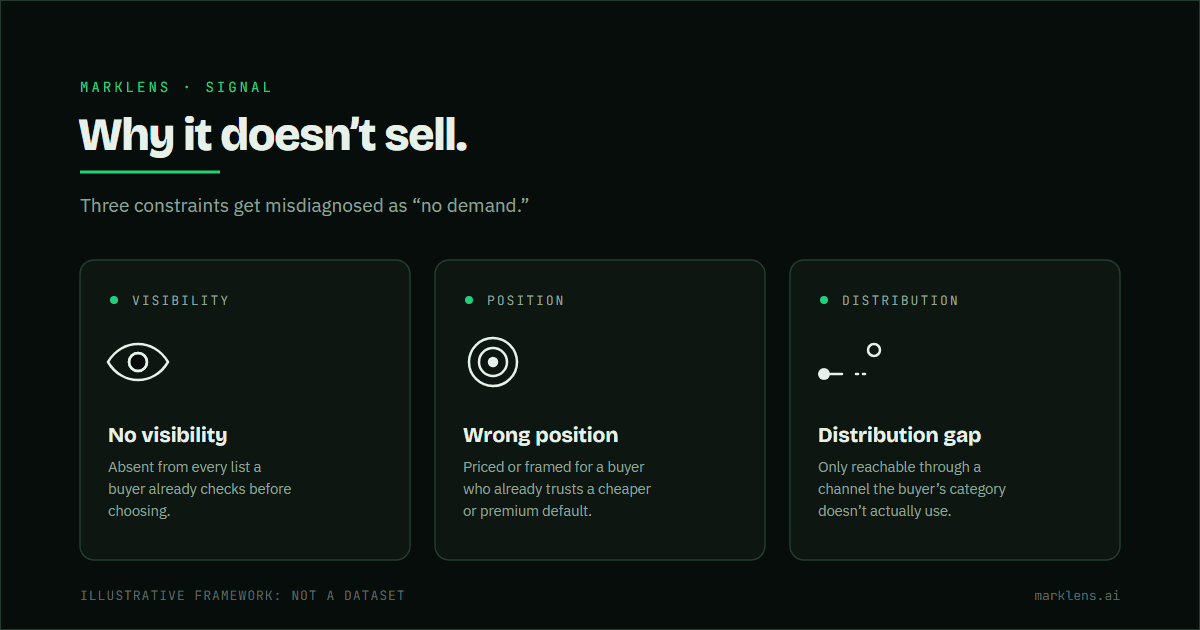
Diagram of three reasons a product doesn't sell: no visibility, wrong position, and a distribution gap, shown as three constraint boxes, not a demand problem.
July 3, 2026

Why “no one wants it” is usually the wrong diagnosis

Weak sales gets misread as weak demand. Usually the real constraint is visibility, position, or distribution.

Read the diagnosis →

Find out why it isn't selling.

One read, free. The verdict in full, and how much evidence stands behind it.

Run a free read →
What a MarkLens read doesFour scattered sources of market signal sit on the left, across a dashed baseline. Lines run rightward from each and converge, arriving at one verdict. The ring around that verdict is only partly filled, with the remainder left dashed, because the confidence it carries is limited to what the evidence supports.SCATTERED SIGNALONE GRADED VERDICT